
LIISE TALU / BRAND STRATEGY · IDENTITY · PACKAGING
Liise talu
A farm brand from Ruhnu - Estonia’s smallest and most far-flung island, adrift in the Gulf of Riga and, oddly, closer to Latvia than to the mainland. Home to some sixty people, a lighthouse rumoured to be Gustave Eiffel’s - and Liise, one of the island’s most driven makers.
A whole brand from a tiny island
The place. Ruhnu is Estonia’s smallest municipality - around sixty year-round residents on twelve square kilometres, marooned in the Gulf of Riga. It’s the kind of island with a 17th-century wooden church, a lighthouse said to be Eiffel’s, and so little trouble it gets by without a police station. Out here, Liise is one of the most driven makers around.
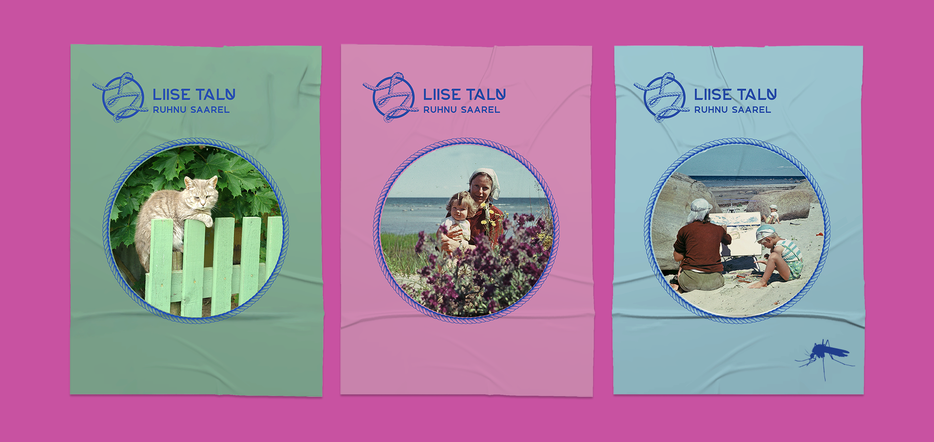
The roots. The rebrand is grounded in real island heritage. We went back through old Ruhnu photographs from the 1970s - the farm’s keeper as a small girl, pictured beside her mother, the artist Ann - and let that lineage shape the brand.
The work. In 2023 Brand Garden rebranded Liise talu from the ground up - a visual identity built to travel from the farm gate to the shelf. Art direction and design by Hanna Jõers, copy by Kaarel, brand strategy by Mari Arnover. We carried it into bread packaging, merch and the everyday touchpoints of island life. Even the colour palette is drawn straight from Ruhnu itself.
And beyond. The system reached past the farm itself: a brand refresh for the island’s annual Liise jooks run and for the Rogain orienteering event. One small island, one coherent visual world.
Gallery
“One of Estonia’s smallest islands - and one of its most complete little brands.”
- Brand Garden × Liise taluResults